williams-oliver.ru


Williams Et Oliver
Информация о проекте
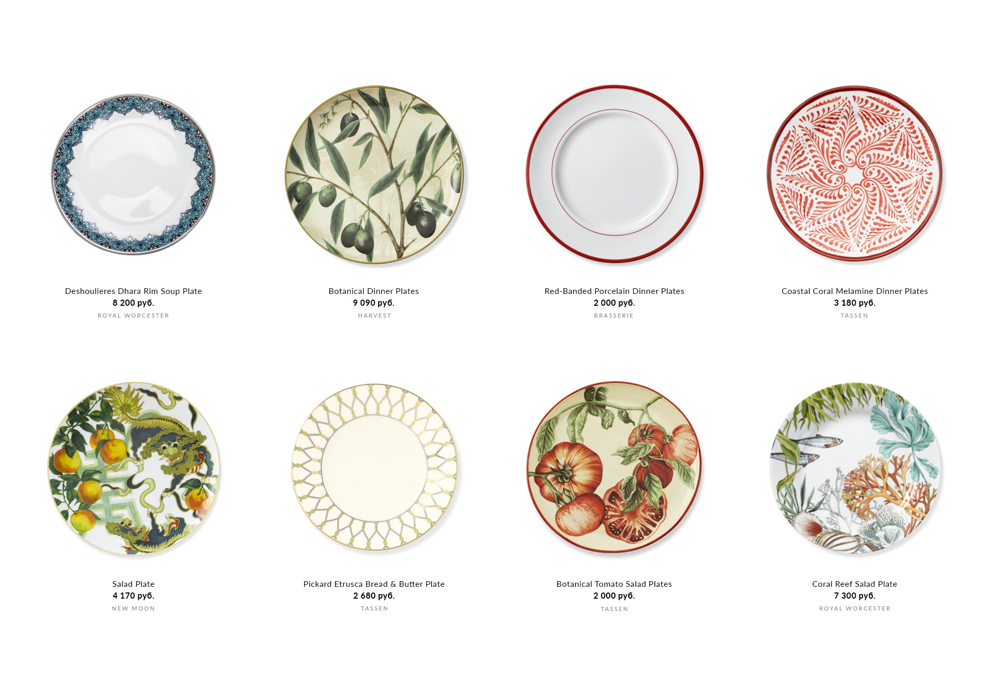
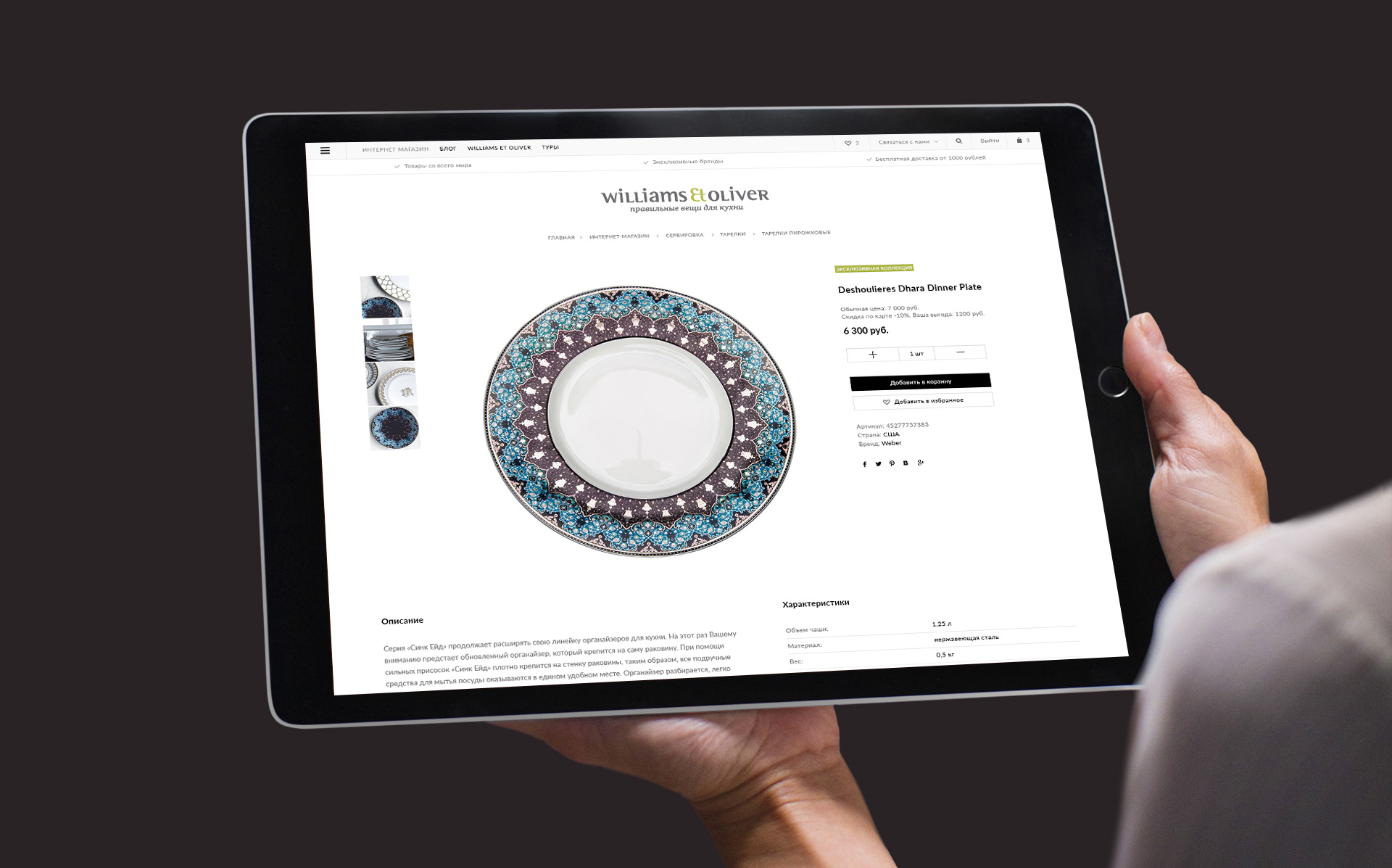
"Williams Et Oliver" is the stores of right things for your kitchen. They have a varied, original and convenient cookware for connoisseurs of culinary art.
Our task was to develop a stylish luxury online store in a minimalist European style.

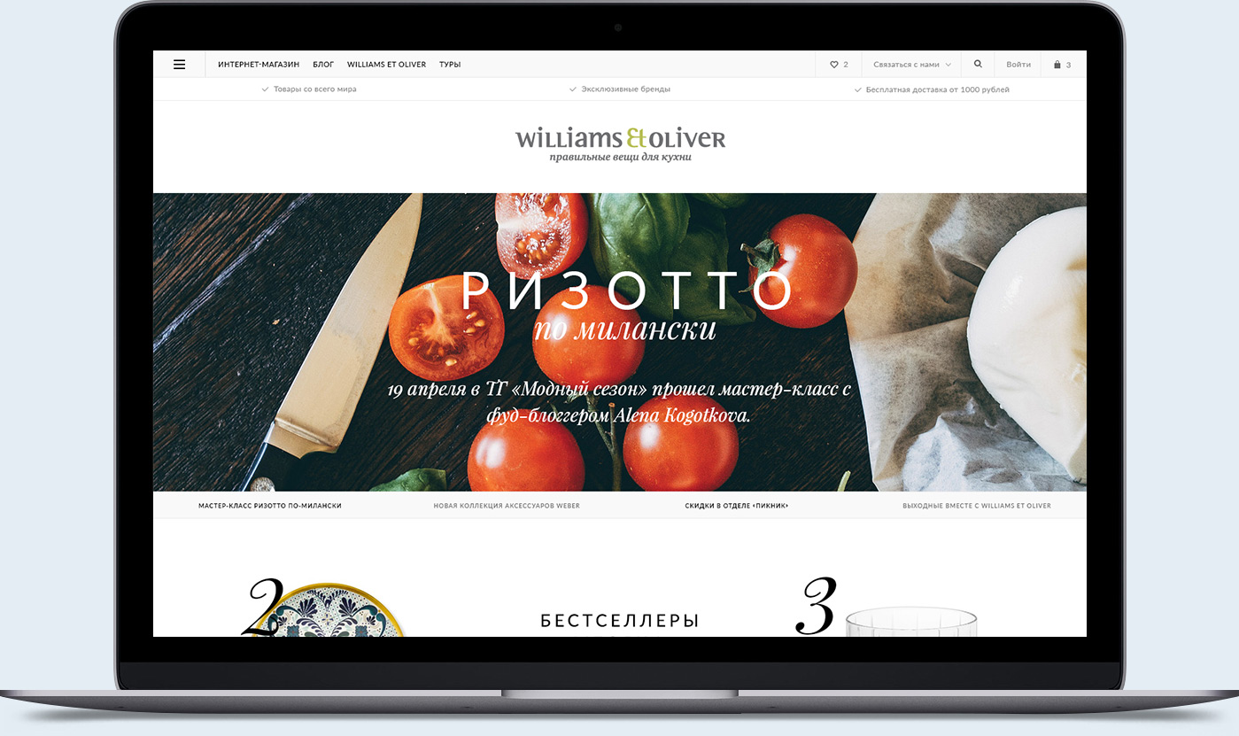
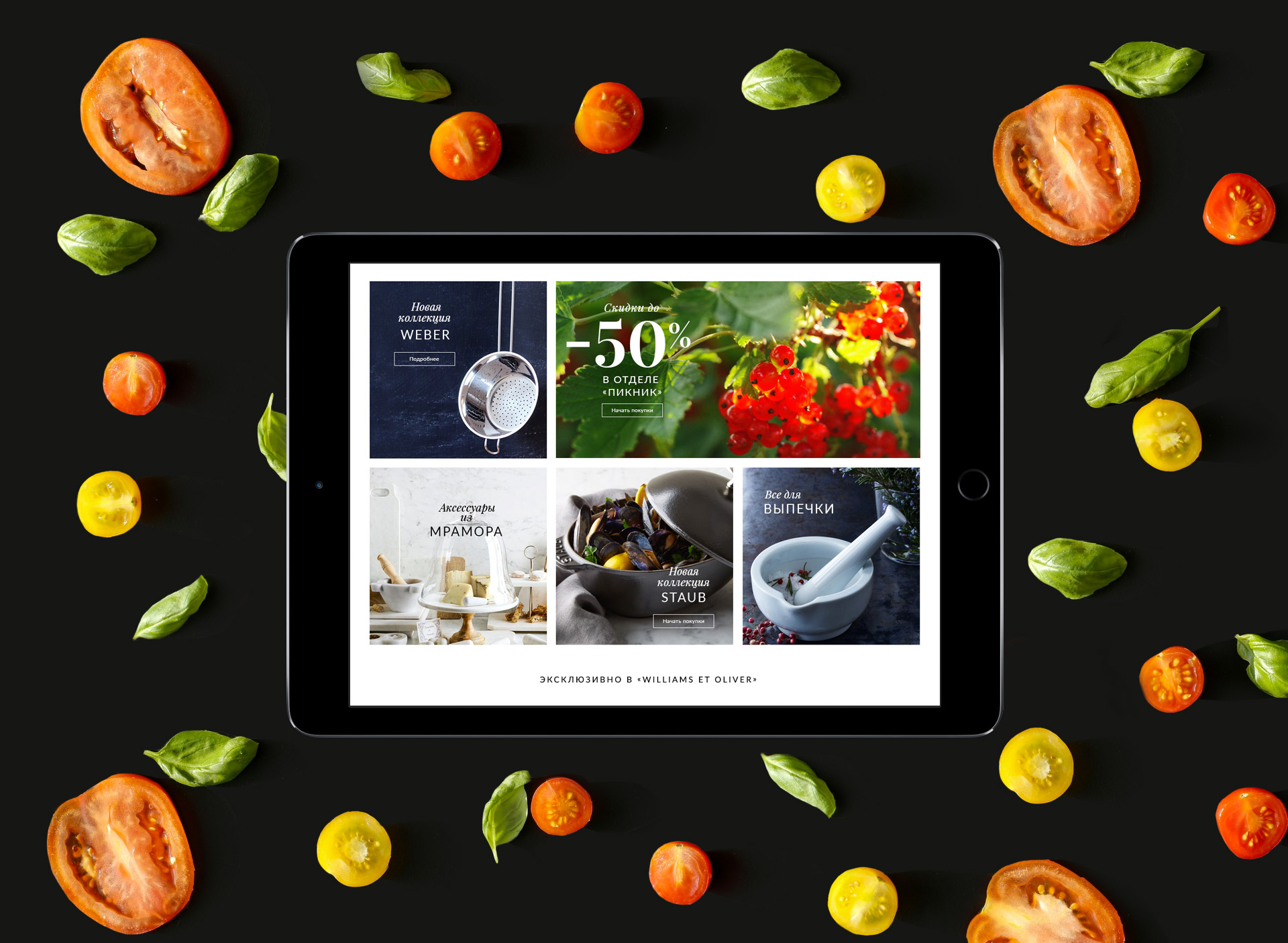
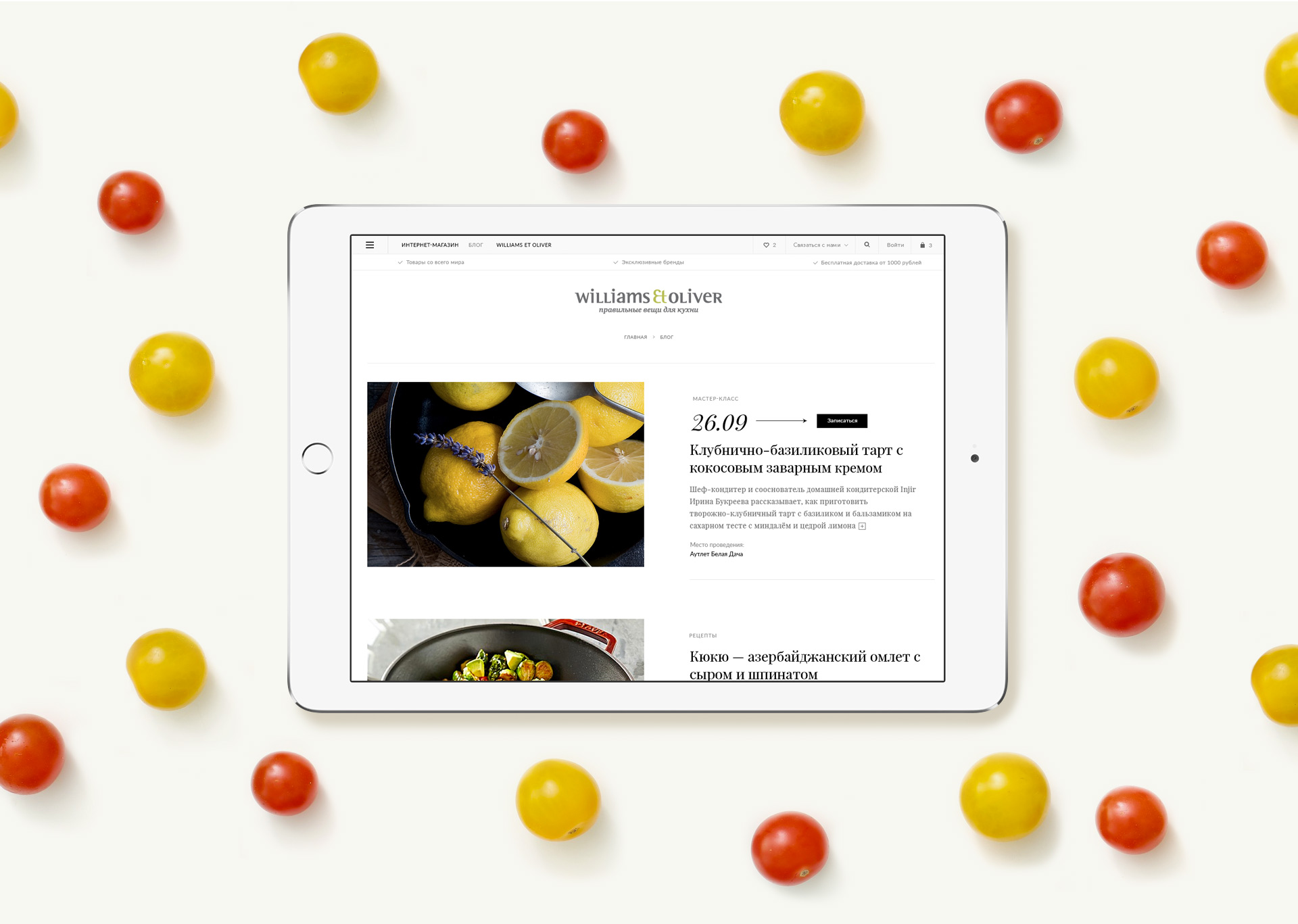
The style of the website is based on a combination of confident typography and aesthetic of the modular grid. The clean interface and visual blocks put the necessary emphasis.


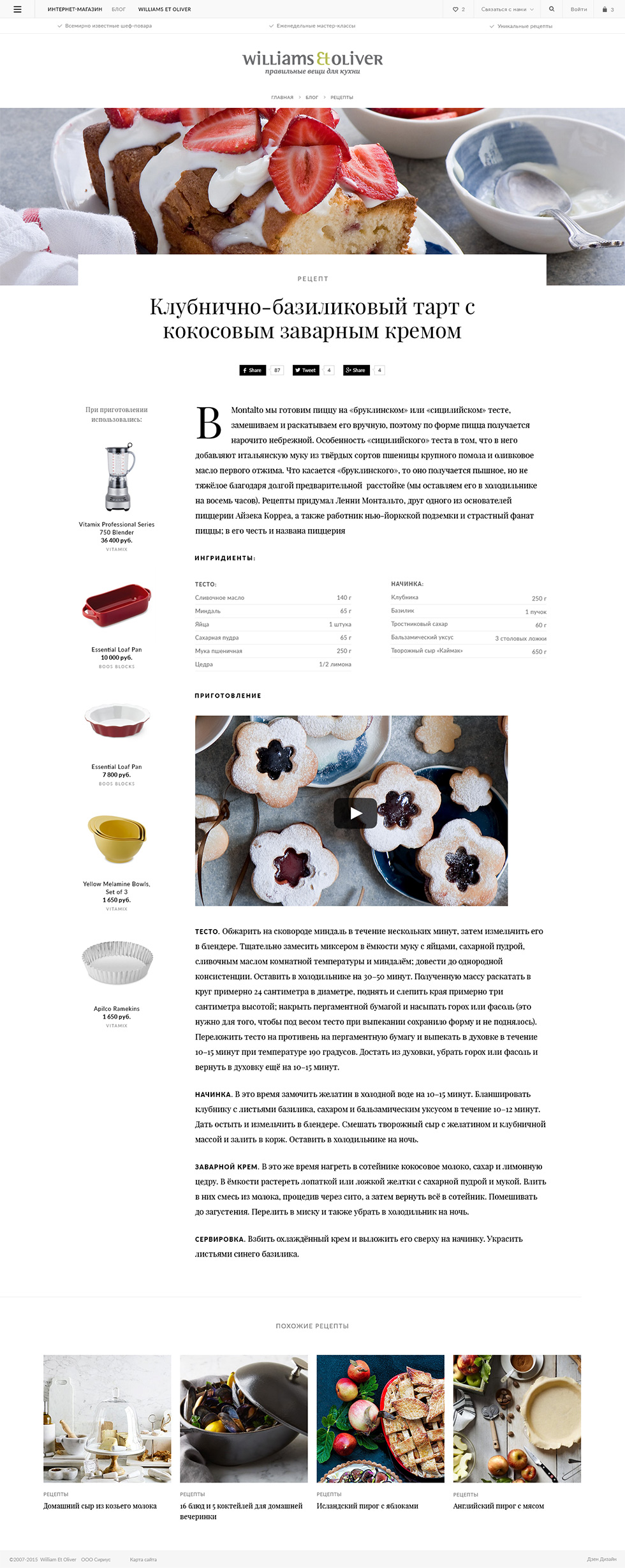
Recipes from the blog logically connected with goods from the store, that are recommended for the preparation of selected dishes.
