www.trio.ru

TRIO
Информация о проекте
TRIO-Interior is a chain of high-end furniture stores established in 1997. The company supplies designer furniture, lighting, and textiles mostly from Italy, but also from Germany, Switzerland, and the United States.
Our task was to design an online shop and its frontend in a premium style.

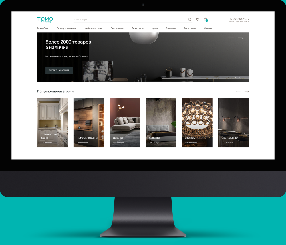
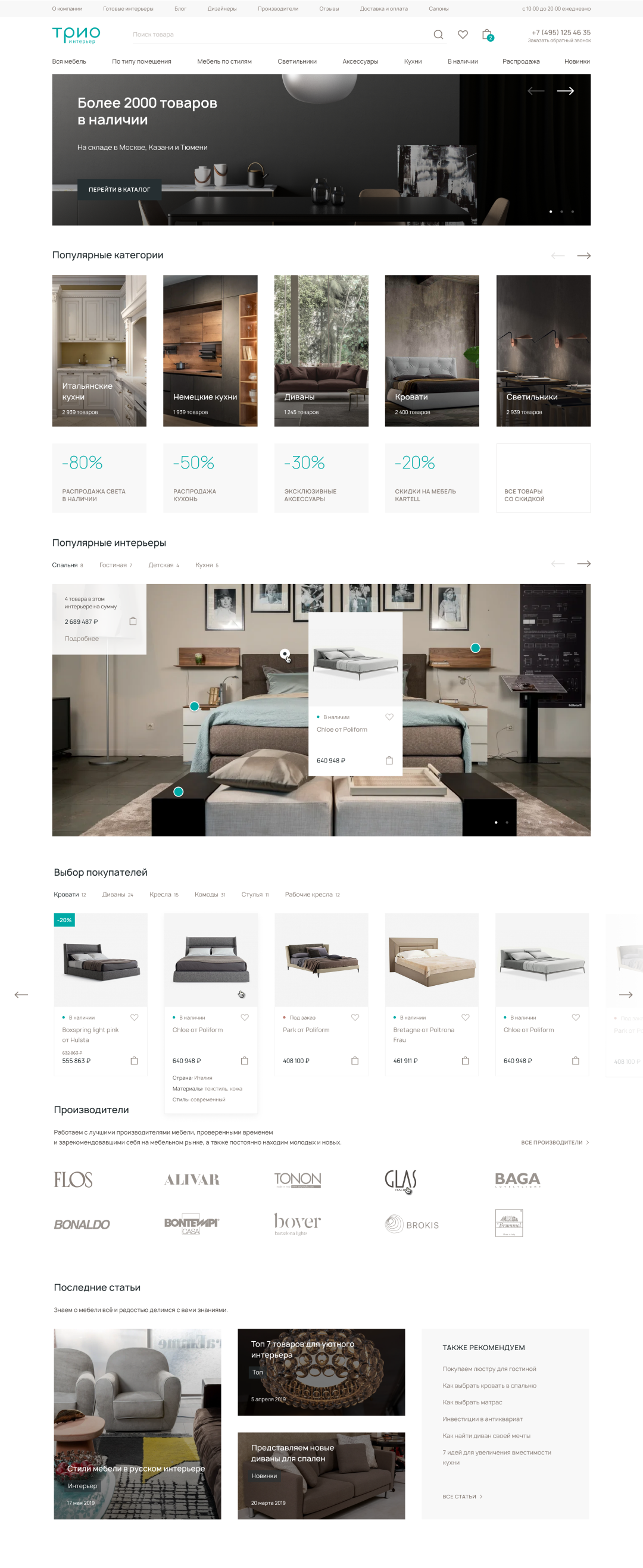
No-frills minimalism serves to emphasize the high-end quality of products, accentuating the truly important things. The main page structure catches the user’s attention immediately, offering various paths to purchase.

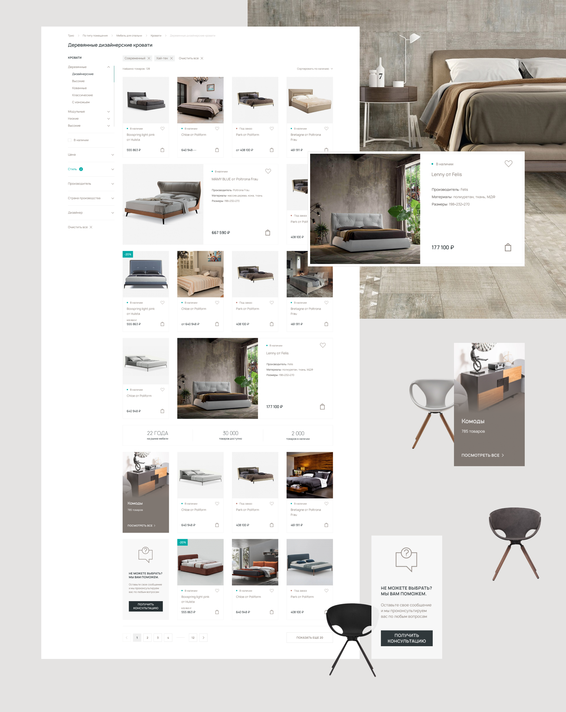
Large-sized product cards breathe life into the catalog, allowing to highlight the key product. A side bar telling about the company’s advantages was added to let the user get the idea of the company’s values. Catalog navigation is made easier by handy filters optimized for the company’s profile.

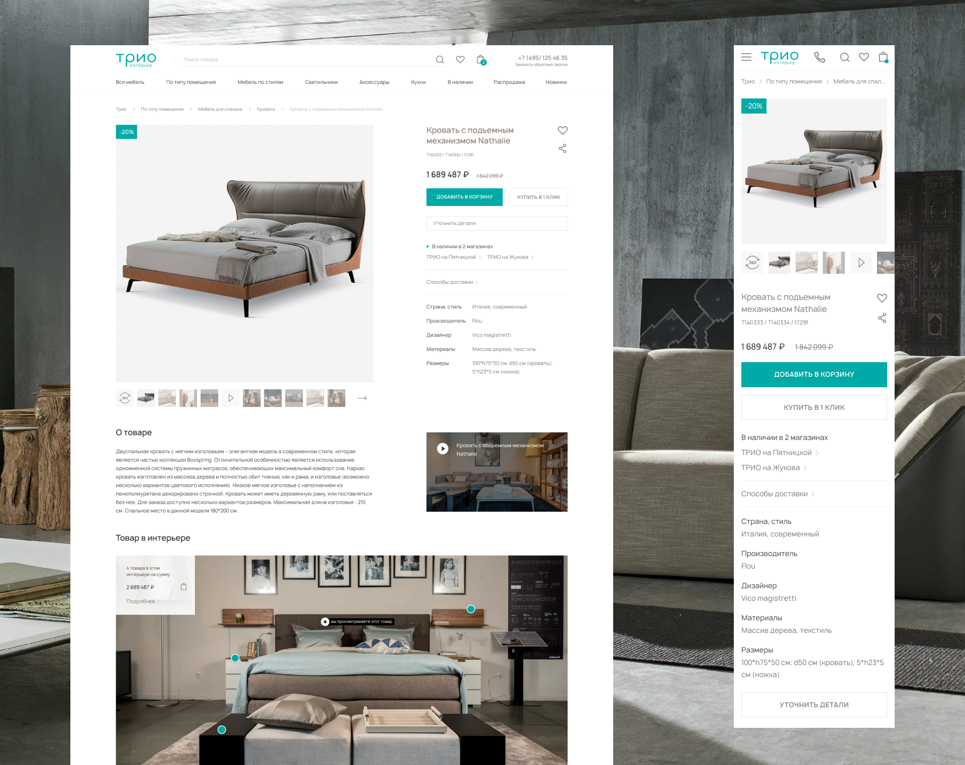
It was vital to prioritize the most important information in the product cards and make it more prominent. The data is perceived easily and consistently thanks to clearly identifiable segments.

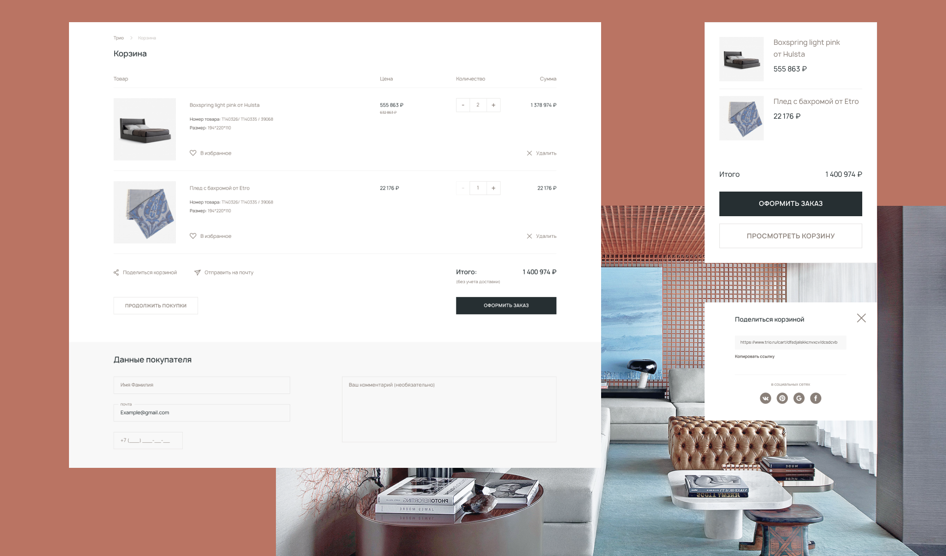
The shopping cart page provides large product images to make it as easy as possible for the customer to review the information and check out.

A funky, eye-catching module demonstrates the products in real-life interiors. Each product has a bright hover button that displays a card allowing to add the product to cart or proceed to detailed information. Should the user like all the products included in a specific interior, they can all be added to cart with a single click.
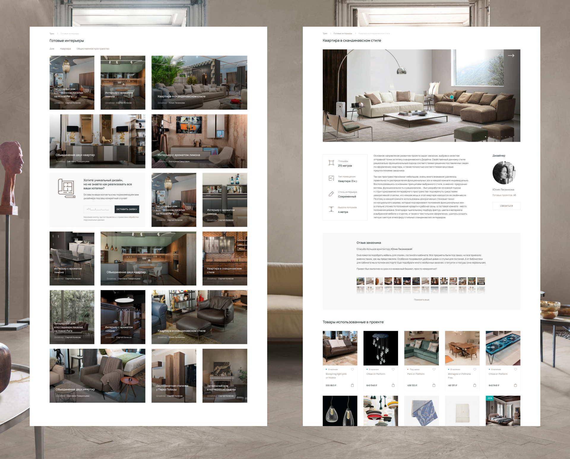
Pages presenting completed projects boost customer engagement. Every project comes with a laconic description module, a reference to the designer, the customer’s review, and a list of products used.

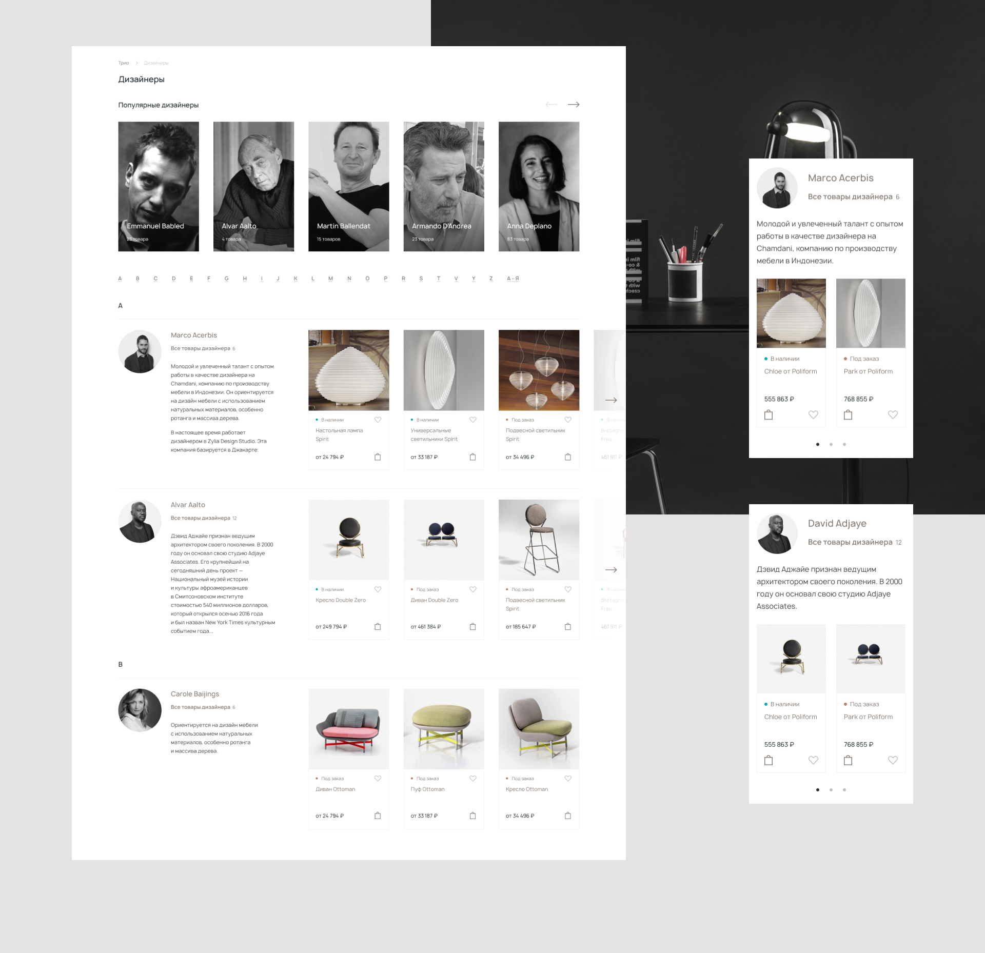
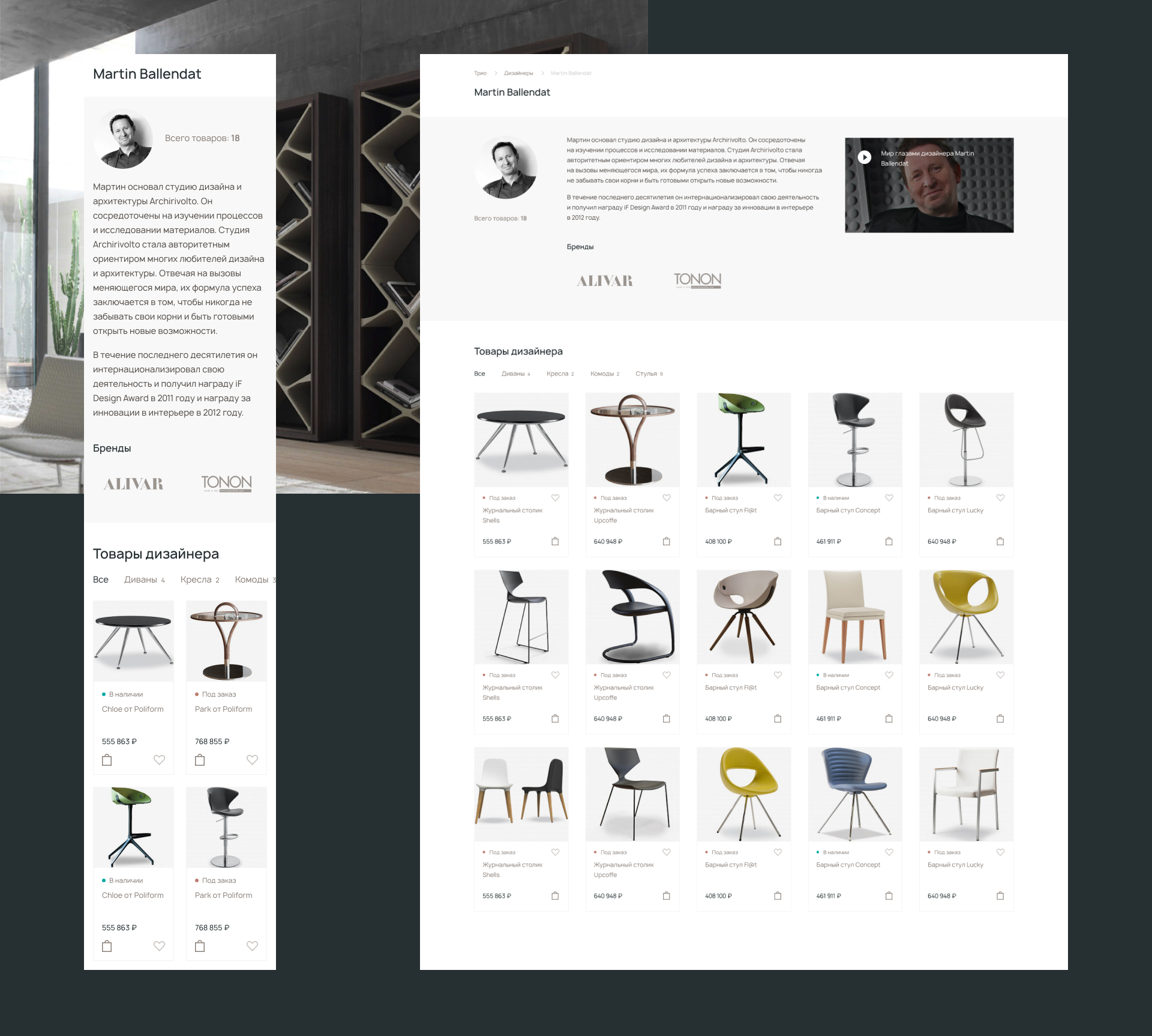
A gallery of dramatic large-scale portraits of famous designers adds vibrancy to the screen.


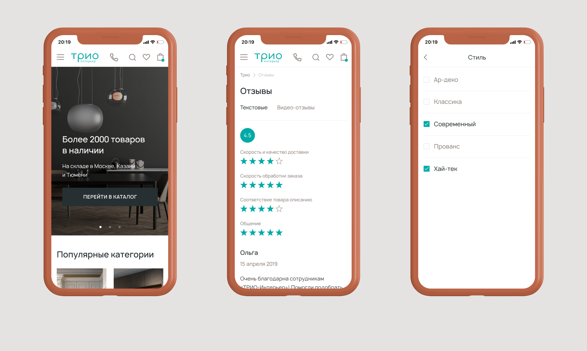
Special attention was paid to adaptability and the mobile version in particular. It took a great deal of effort to make the catalog filters and other website elements fully responsive.
