lukino.ru

Lukino
Информация о проекте
Lukino is a private farm in Tula region that sells its products via its own online shop.
Our task was to develop a new online shop including design and front-end, improve website usability, and increase the conversion rate. It was important to convey the message that all products on the website come from a private farm.
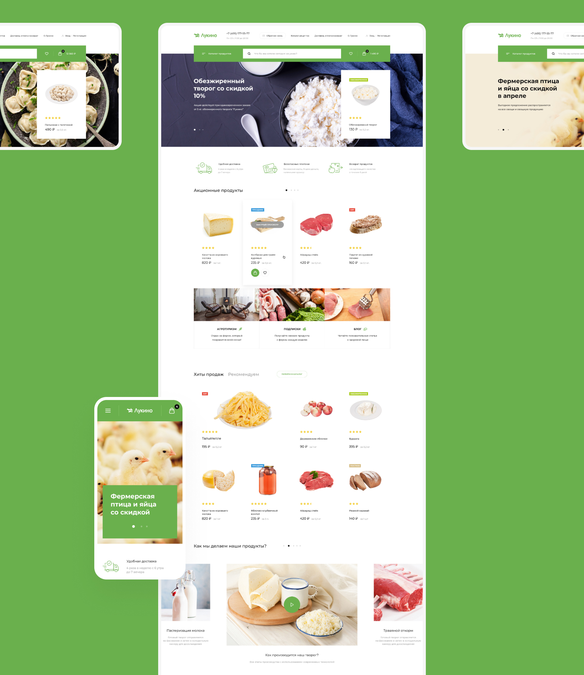
The home page, divided into functional modules, has a long-scrolling layout and tells the user how the farm and the website work. Clean and light design gives a freshness accent and keeps the user focused on the most important—the product. Simple, non-intrusive animation makes website navigation easier.

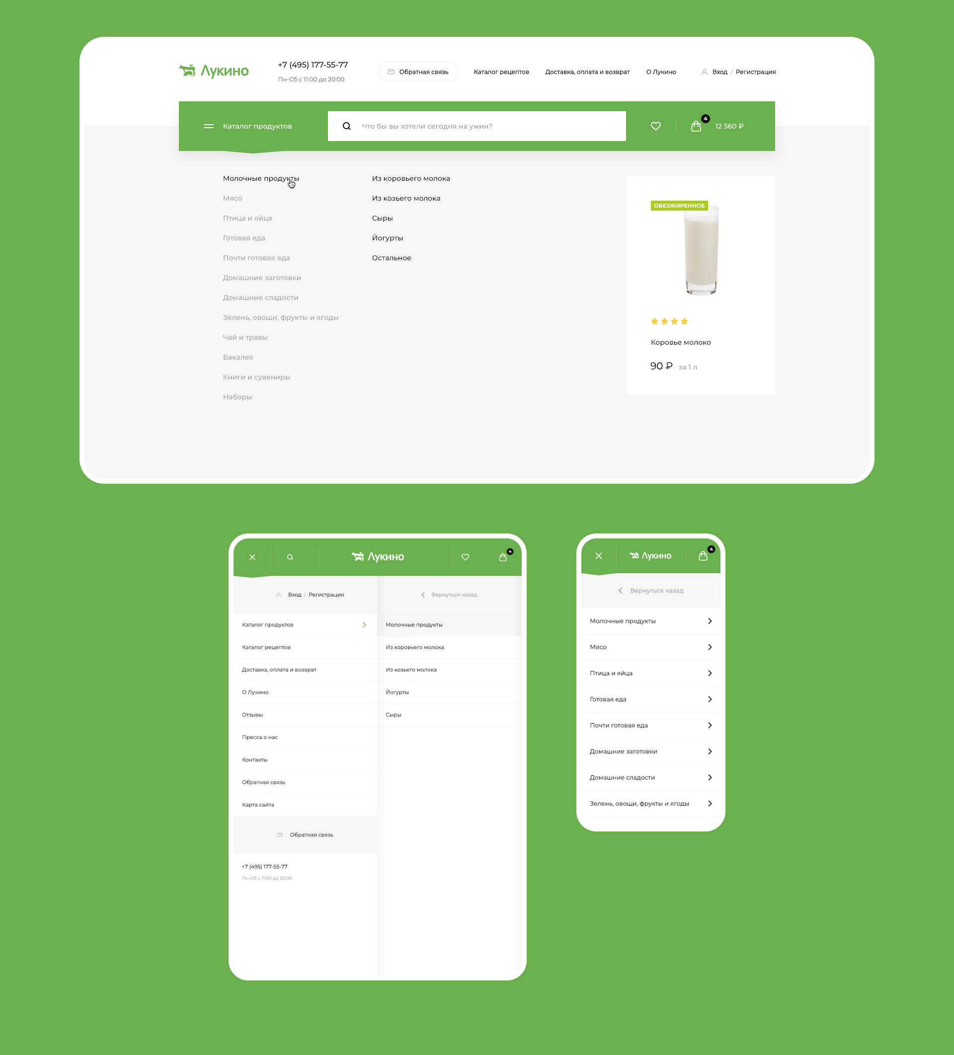
The drop-down product catalog is elaborated to fit every type of device. The desktop version features a convenient mechanism of switching between the menu levels as well as selected products in each category, which provides category visualization and helps promote specific products. The tablet and smartphone versions have a touch-friendly interface adaptive to different screen sizes.
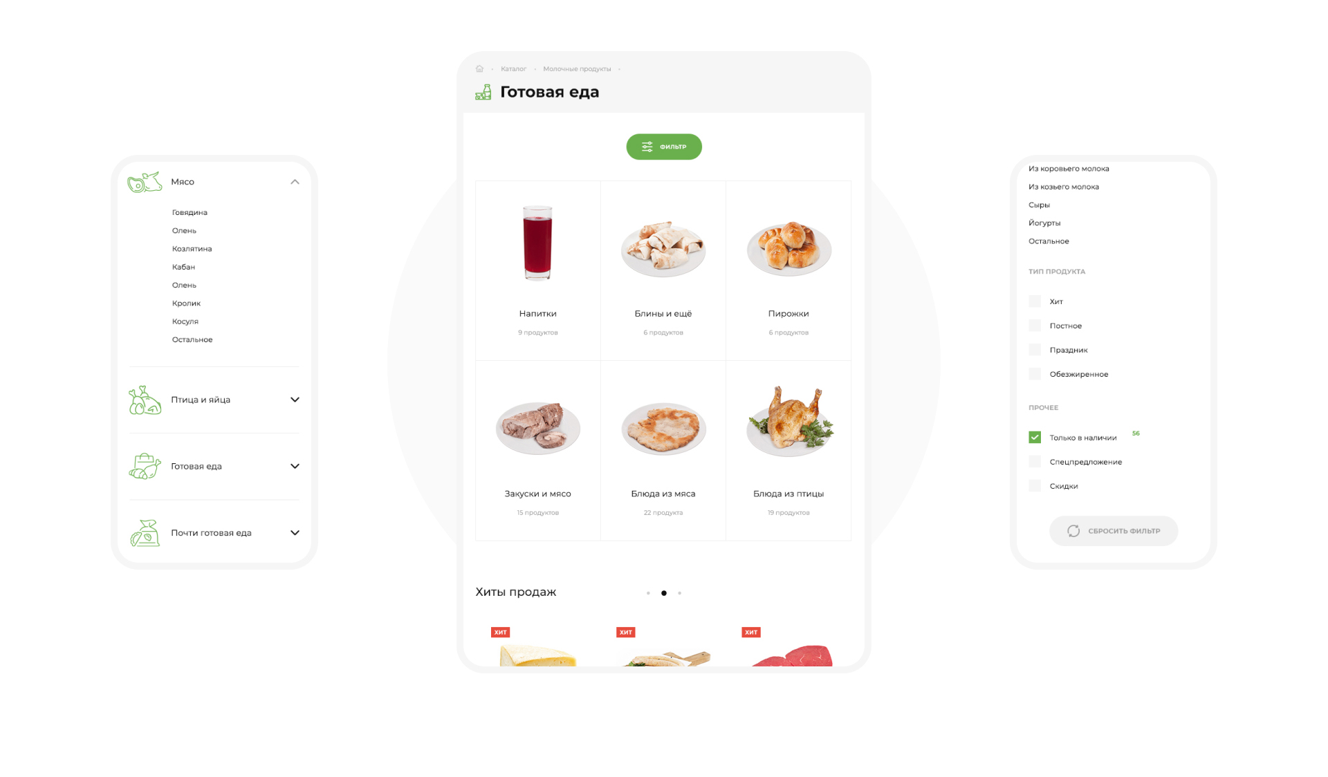
The product catalog has a few levels to make it easier for users to find what they want. A search bar with product preview is available as an alternative navigation option for targeted search.

The product catalog has a few levels to make it easier for users to find what they want. A search bar with product preview is available as an alternative navigation option for targeted search.

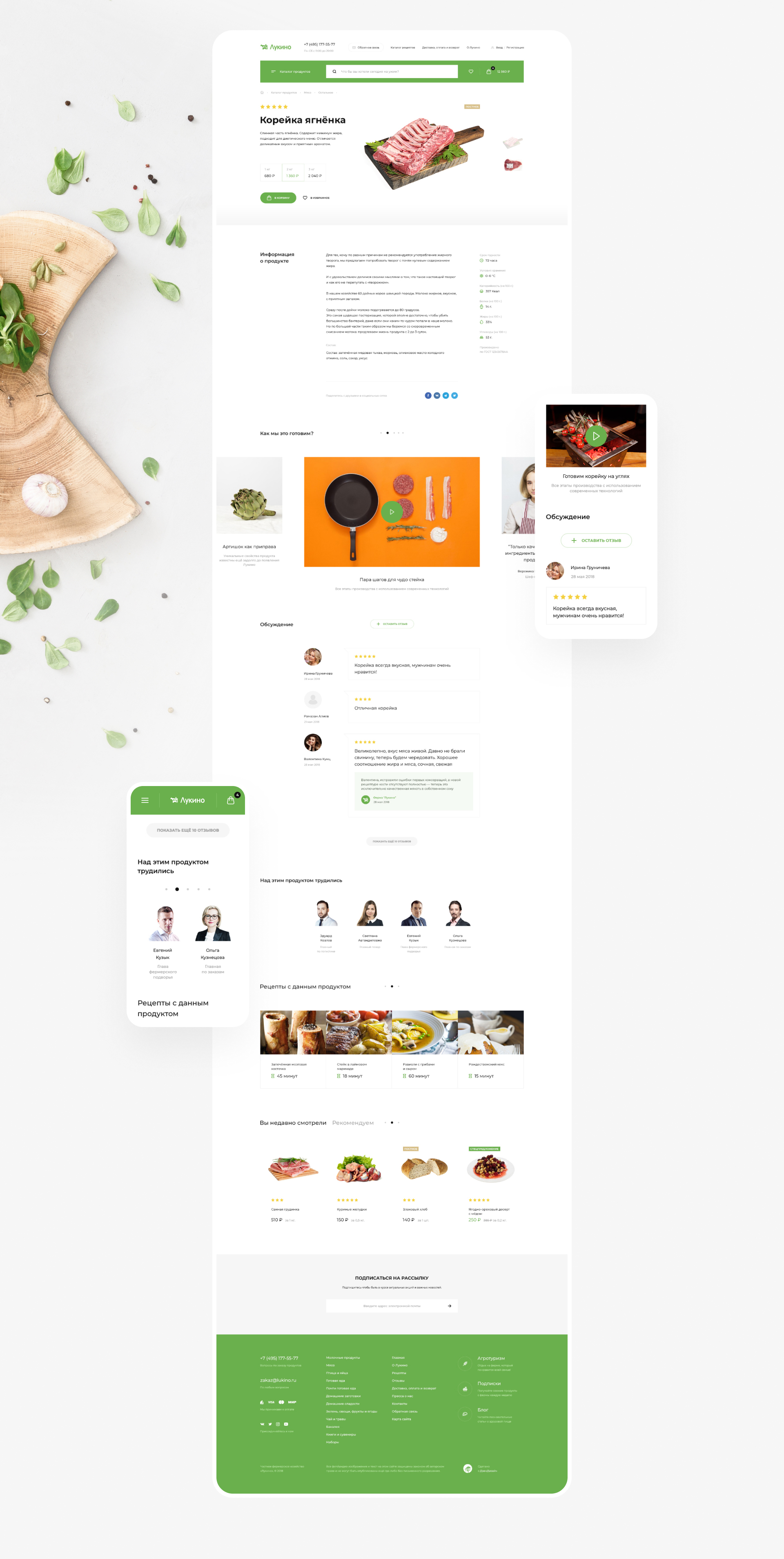
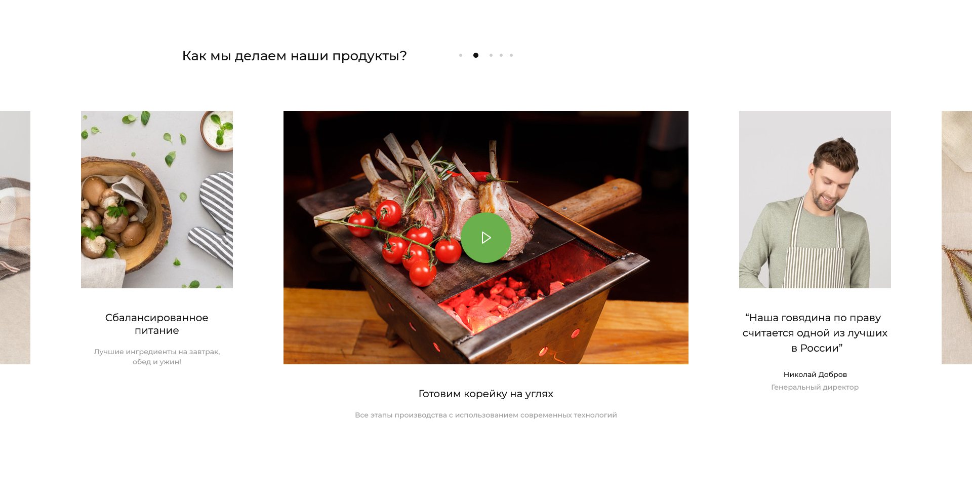
We made product cards as informative as possible. Product milestones are listed separately from the general description and supported with pictograms. Short information modules illustrate the production process and introduce the farm workers involved in it to the user, adding to website personalization.

One of the key redesign objectives was to convey the message that all the products in the online shop are grown and produced in a clean environment of a private farm, so detailed production process descriptions were added to every product card to enhance customer trust and engagement.

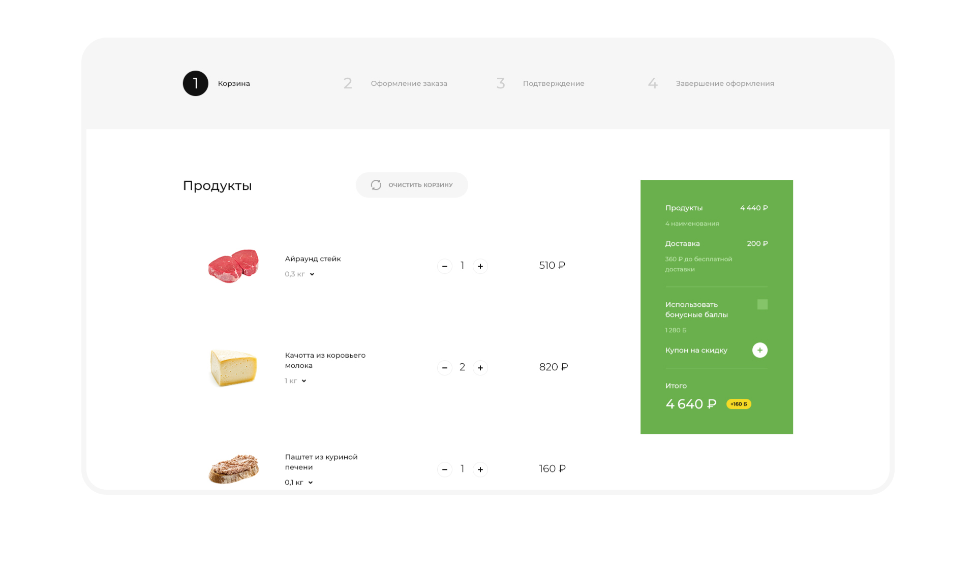
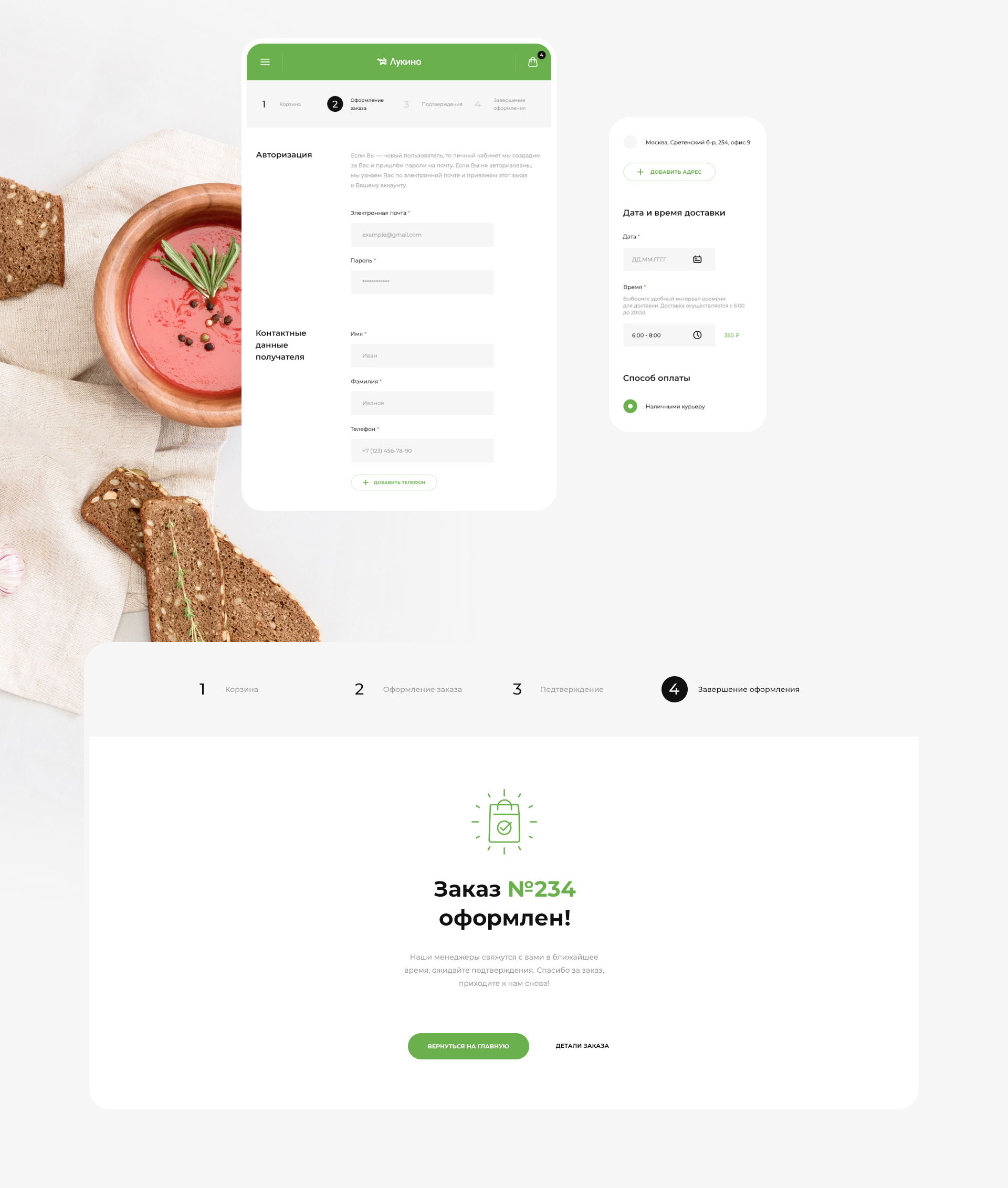
As customers are intuitively guided through the checkout process, a progress bar helps them figure out where they are right now.

Order placement is simple and efficient.

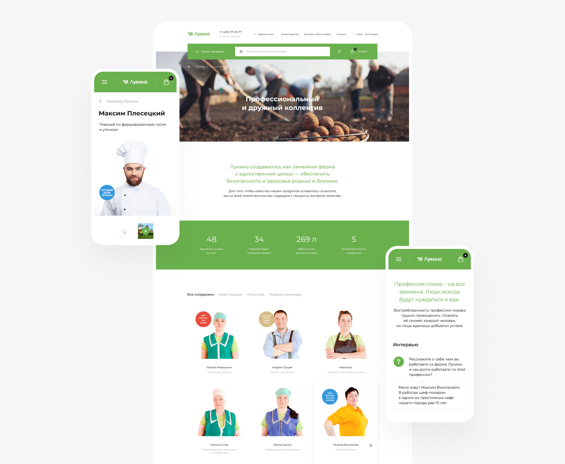
To make the company stand out even more, we decided to introduce the farm workers to customers. In interviews, the farm workers are talking about what they love and care about the most in their work.

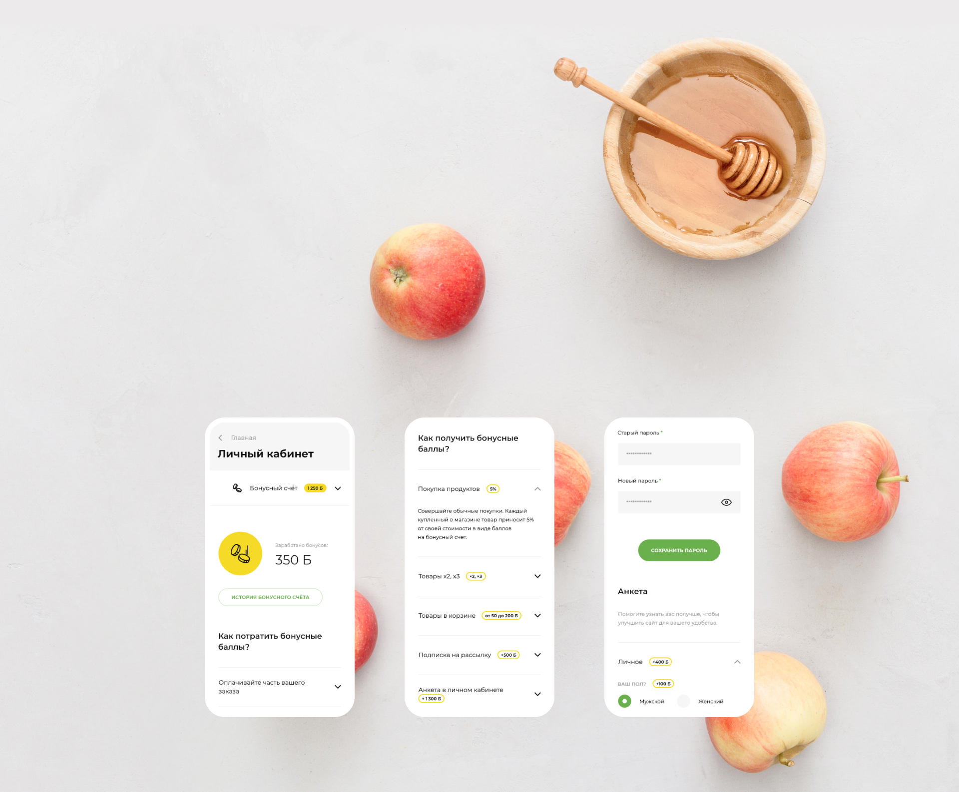
The personal account with surveys, bonuses and order history is easy to use from either a desktop or mobile device.

We also designed unique farm-themed icons for the purpose of catalog visualization as well as for other interface needs.
